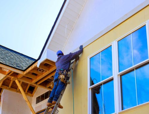
A home’s exterior creates the first impression, powerfully reflecting personal style and setting the property’s tone. Achieving a “sleek and contemporary” look involves more than architectural design; colour is pivotal. Contemporary aesthetics emphasize clean lines, simplicity, and sophistication. Intentional use of colour can create contrast, highlight features, or convey refined order. The choice of exterior paint and siding colours is paramount. This guide offers seven distinct, stylish exterior colour schemes embodying a modern feel, a starting point for embracing modern elegance. The right palette is key to unlocking a home’s contemporary potential.
Scheme 1: Monochromatic Mastery – Shades of Grey
Layering various shades of grey, from light to deep charcoal, crafts a sophisticated, unified, and minimalist exterior. This monochromatic approach uses subtlety and texture for modern impact. The main body might feature a mid-tone grey, like slate or warm stone. Accents and trim can be a lighter grey, such as soft dove grey, or a dramatically darker grey approaching black, like iron ore. This creates depth and highlights architectural details without competing colours, allowing the home’s form to be central.
The result is an understated elegance, exuding a modern, sometimes industrial-chic, yet calming presence. This scheme pairs well with metal roofing, dark window frames, natural stone, and concrete elements. Minimalist landscaping with structural plants enhances the contemporary feel. To prevent flatness, vary textures: combine smooth siding with a textured stone feature. This approach allows homeowners to invest in modern style and modern quality siding that truly stands out.
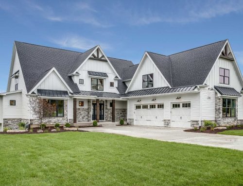
Scheme 2: High-Contrast Impact – Crisp White & Bold Black
The combination of crisp white and bold black is a timeless pairing yielding a strikingly modern exterior. This high-contrast scheme emphasizes architectural lines with clarity, creating a clean, sharp, and undeniably sophisticated aesthetic. Typically, the main body is a bright, crisp white or a very light off-white, providing a luminous backdrop. Accents like trim, doors, and window frames are then rendered in a true, deep black or very dark charcoal for maximum definition.
This bold, graphic approach suits a minimalist, sometimes Scandinavian-inspired, vibe. It makes a strong visual statement, highlighting the home’s form. Complementary materials include black metal accents (roofing, railings), dark wood features for warmth, large glass windows, and simple geometric landscaping. For maximum impact, ensure the white is genuinely crisp and the black is deep and rich. This powerful contrast can dramatically make bold statement to bust your homes curb appeal.
Scheme 3: Moody & Modern – Deep Charcoal/Near-Black with Warm Wood
For a dramatic, sophisticated contemporary look, pair dark, almost black, siding with the natural warmth of wood accents. This creates luxurious depth and modern intrigue. The main body might be deep charcoal, off-black, or a very dark, desaturated navy or forest green. These dark hues offer a bold, grounding presence. Balancing this intensity involves introducing natural wood tones—cedar, teak, or redwood—for elements like soffits, garage doors, entryways, or feature walls.
The trim often matches the main dark body colour or is a slightly lighter, dark neutral, maintaining cohesion. The resulting vibe is luxurious and contemporary, inviting yet bold, fostering a strong connection to natural materials. This palette is beautifully complemented by black window frames, stone or concrete pathways, and warm exterior lighting to highlight wood texture at night. The quality and finish of wood accents are crucial; ensure proper sealing and maintenance against Canadian elements.
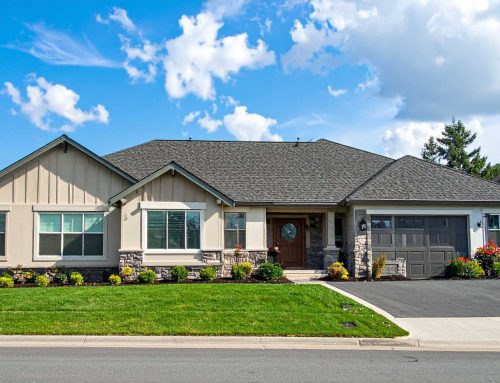
Scheme 4: Earthy Elegance – Sophisticated Neutrals with a Pop
An exterior grounded in calming, sophisticated neutrals offers a modern yet approachable appeal. Warm greys (greiges), soft beiges, muted taupes, or desaturated greens and blues provide an elegant backdrop. These earthy tones create harmony with natural surroundings. The palette’s sophistication is elevated by a single, bold accent colour, typically for the front door or another small architectural feature. This “pop” creates a focal point and injects personality.
Trim is usually a classic cream, soft off-white, or a slightly darker/lighter shade of the main body colour, ensuring subtle transition. The accent colour for the front door could be deep teal, warm burnt orange, sunny yellow, or rich red. The vibe is welcoming, subtly sophisticated, and feels both modern and timeless. This scheme pairs well with natural stone, wood details, brushed metal hardware, and soft landscaping. Use the accent colour sparingly to maintain a sleek feel; the front door is often the perfect canvas.
Scheme 5: Coastal Cool – Serene Blues & Greens with Crisp Whites
Inspired by nature’s calming qualities, a coastal cool scheme uses muted or deep blues and greens paired with bright whites or light creams. This creates a refreshing, tranquil, and distinctly contemporary look. The main body could feature slate blue, dusty teal, sage green, or even a deep navy for drama. These nature-inspired hues evoke serenity and connection to the environment, whether near water or in an urban setting.
To maintain a crisp, modern feel, trim and accents are typically bright white, soft off-white, or very light grey. This contrast highlights the main colour and adds fresh appeal. The vibe is tranquil and sophisticated yet relaxed, embodying a modern coastal sensibility. Complementary materials include light-toned wood, natural stone, and silver or brushed nickel hardware. Airy landscaping, perhaps with ornamental grasses, enhances this aesthetic. This versatile scheme suits homes with abundant natural light. Remember, your choice reflects who you are and your connection to these natural tones.
Scheme 6: Dynamic Duo – Sophisticated Two-Tone Schemes
Using two distinct but complementary colours to highlight different architectural elements or levels creates significant visual interest and a modern feel. This two-tone approach moves beyond a single body colour, allowing for a more custom appearance. For instance, a dark grey lower level can ground the home, with a lighter grey or white upper level adding perceived height. Alternatively, a neutral main body could pair with a contrasting colour on a prominent gable or extension.
A successful two-tone scheme requires a clear, pleasing relationship between colours. They could be different shades of the same hue, or a neutral paired with a muted colour. The vibe is architecturally interesting, bespoke, and can manipulate perceptions of scale. This approach works well with mixed exterior materials, like siding and stone, as colour changes can align with material changes. Ensure colour divisions follow architectural lines for cohesion. Avoid too many competing colours to maintain contemporary impact. Properly executed, a two-tone scheme can truly attract potential home buyers.
Scheme 7: Urban Edge – Dark Neutrals with Metallic Accents
For an industrial-chic or ultra-modern aesthetic, combine deep, sophisticated neutral body colours with the sleek sheen of metallic finishes. This creates an urban edge that is both luxurious and contemporary. The main body might be dark grey, rich bronze, deep muted brown, or even blackened tones that absorb light and create a strong presence. The “surprise” and sophistication come from carefully chosen metallic accents.
These accents can apply to front doors, window frames, gutters, light fixtures, or architectural panels. Finishes like copper (which patinas over time), corten steel, dark bronze, or stainless steel provide stunning highlights. Metallic paints can also be effective. Trim often matches the main body or is a subtle metallic shade. The vibe is edgy, luxurious, and highly sophisticated. This scheme pairs well with concrete, raw wood, large glass expanses, and minimalist hardscaping. Use metallics strategically; too much can be overwhelming. It is also important to complete the look by complementing your siding to your roof and these metallic touches.
Key Considerations Before You Pick Up the Brush
Choosing an exterior colour scheme involves more than picking attractive colours; practical factors ensure a successful result. The home’s architectural style is paramount; the palette should complement its lines and character. Consider surroundings: the natural environment, neighboring homes, and landscaping should inform the decision, aiming for harmony. Natural light significantly impacts how colours appear; observe light at different times of day.
The existing roof colour is a major fixed element and must factor into the scheme. Consider existing unpainted materials like stone or brick. Always test large paint samples on the actual exterior in various lighting conditions before committing. Finally, check for any Homeowners’ Association (HOA) or neighborhood regulations that might restrict colour choices. These considerations ensure a choice that is both beautiful and appropriate.
Your Home, Your Hue, Your Harmony
A well-chosen exterior colour scheme is truly transformative. It acts as the finishing touch that brings a contemporary home design to vibrant life. While these seven schemes offer sophisticated starting points, the ultimate decision should resonate personally. Choose a palette that will be cherished for years, moving beyond fleeting trends. Colour is a powerful tool; it highlights a home’s best features, creates a desired mood, and significantly boosts curb appeal. By carefully considering all factors, homeowners can select a palette that is both sleekly contemporary and authentically right.